Friday, 22 June 2012

iPad paintings - which App?

I get a ridiculous kick out of drawing on my iPad. I have tried various bits of drawing software: ArtRage, ArtStudio, Sketchbook Pro, but my favourite remains to be Brushes. I can see that compared to one or two of the others Brushes actually has some limitations. But it is about style, I think.
For example, here's one done in ArtStudio:
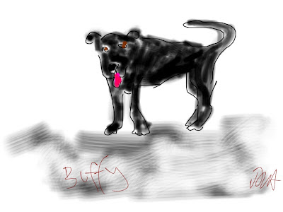
Buffy
OK. but kind of clunky: lots of different drawing options - but where are they? Loads of settings but not the most responsive programme in the world.

And here's one from ArtRage:
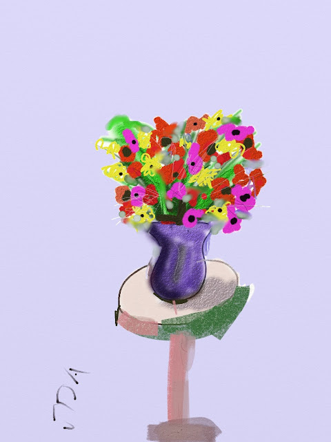
Flowers in purple vase

ArtRage is better than ArtStudio - easier to use with some interesting b rush effects that seem pretty unique to the programme. But again not that instinctive. I can never remember which logo means what - which folder do I need to get a different pen, colour, layer etc?

And here's one from Sketchbook:
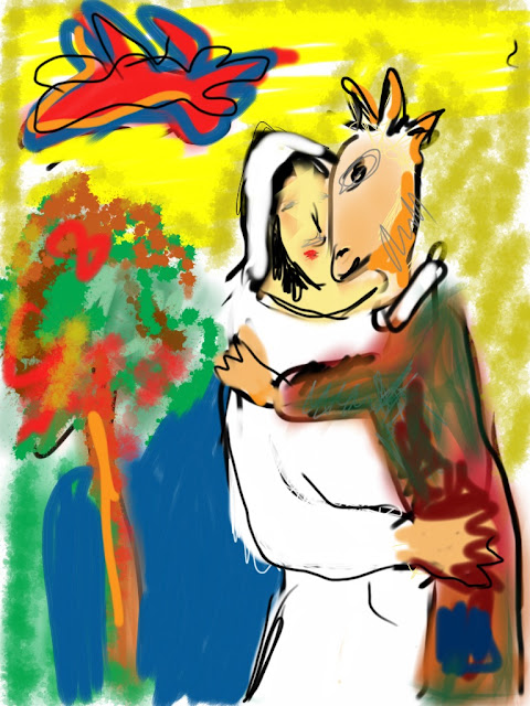
Chagall iPad Wedding

Sketchbook Pro was the first programme on iPad I tried. It's pretty good - with a similar range of options, brushes, textures to ArtRage, and a very good smudging option (as you can see). But again it's clunky. You have to think too hard to get it to do what you want it to do.

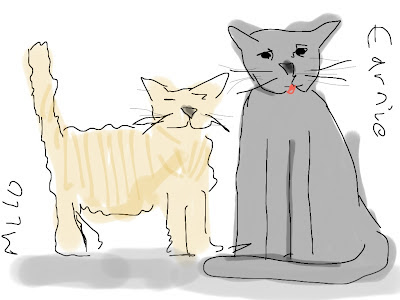
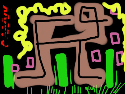
And here are my most recent Brushes paintings:
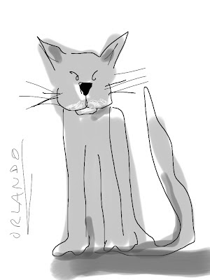
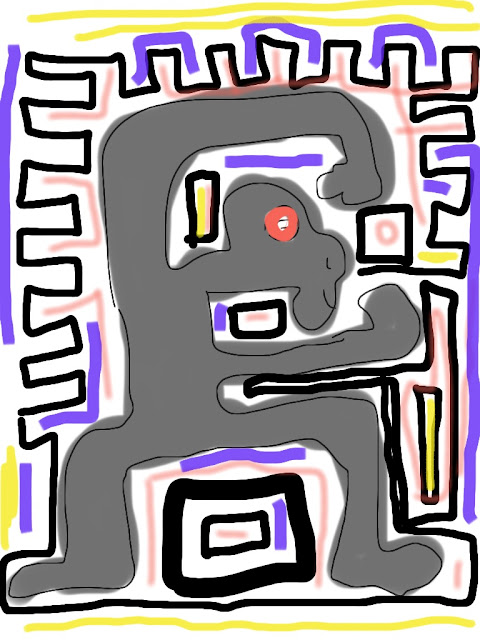
Orlando

Life in general
Milo and Earnie

Magnificent Creatures

Brushes is simpler - has less options, less effects - and is the most instinctive and easiest to use by a mile. I end up producing two types of work which I would categorise as ink drawings and screen prints. Since these are two of my favourite physical ways of making images, maybe it is no surprise I like Brushes best. My only other bit of advice on this is - get a stylus. Fingers are great to draw with, but a stylus offers a bit more accuracy, and is worthy the few quid one costs.

My one wish would be for a bigger iPad! Defeats the iPad point maybe, but I like the idea of an A3 touch screen drawing pad.
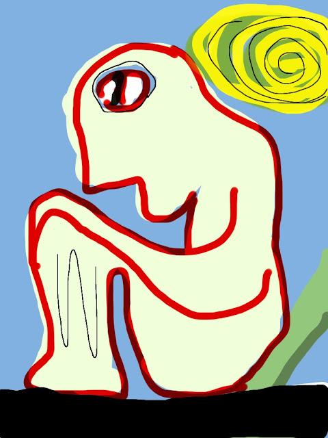
Hot day

Wednesday, 20 June 2012

Black and white and red all over


20% off all my stuff at Fine Art America using discount code TTMKBY!! Valid until Sept 18. Go to: http://david-abse.artistwebsites.com/


Meanwhile here's a new one (especially for my socialist welsh audience):
dinistrio gan cyfalafiaeth

Saturday, 16 June 2012

Everything counts (in large amounts)

There are a number of greedy people running banks, businesses for their own benefit, not for anyone else's. Because of their actions businesses go bust, millions of people lose jobs, people starve, people are homeless - whole county's futures are put at risk.  As a socialist I believe that the way of dealing with this crap is by having a government that simply does not allow this to happen - nationalise banks, nationalise industries, put power and money back into the hands of ordinary people, out of the hands of the greedy, corrupt few. Meanwhile, i can paint, Everything counts.
Everything Counts

Thursday, 14 June 2012

Olympic Gymnastics, Let's Go - A dilemma

Artistic Gymnastics
So this painting got entered into the Outside The White Cube olympic competition. And got accepted, which is nice. However, when I submitted it I didn't think of one thing - how the bloody hell am I going to get the damn thing to London? It's a monster: 180x120cm. Courier charges are over £100, and that doesn't guarantee it being delivered when it's supposed to be, and doesn't include the mile of packaging needed. Jeez, what to do. It occurred to me that I could drive our van to London for a cost of £300 - but then there;'s the getting home again - another £300. So that's only feasible if I can split the costs with someone who needs stuff delivering either/both ways. Hmm. Got about 4 weeks to figure this out! Any ideas welcome.

In the meantime,. here's a new one, which I've called "Let's go" for a whole variety of reasons. Back to my more Pollocky abstract expressionist type of thing. No apologies - I sold one of these earlier this week.

Let's go

Tuesday, 12 June 2012

Red and blue and brownie

Here are two new paintings, plus two little things called " art brownies" I've done for this place in Canada. The brownies were fun, I kept going back to them and adding things in between other stuff - sticking on stuff, painting, screwing in bits of metal. I wanted them to be completely different from what they started out as - two lumps of wood.

The paintings continue my interest in frames. It always interests me how frames actually change how pictures can look, to the extent that they become part of the painting - yet in many cases when you see old paintings in galleries the framing wasn't carried out by, nor even suggested by the artist. This was something I was interested in many years ago - the idea of framing work within work so that the work is integrally framed by the artist - so I've been working on making frames ON the canvas. In this case using acrylic gel combined with paint. The gold adds to the frame effect. However, the painting content is contained within the frame, and the frame is designed to complement - and contrast with - the picture. Red and blue thoughts are dominating my brain at the moment.

Abstract Brownies

Red attack 
Red v Blue (framed)

Friday, 8 June 2012

Here Lies Love

I've appropriated a David Byrne song title for this painting. "Here Lies Love" was a collaborative concept album made with Fatboy Slim and some others. I like some of it.

Here's some of the lyrics:


The most important things are love and beauty
It doesn’t matter if you’re rich or poor
To prosper and to fly, a basic human right
The feeling in your heart that you’re secure
Is it a sin to love too much?
Is it a sin to care?
I do it all for you
How can it be unfair?

Kind of weird that this is all about Imelda Marcos. My painting has nothing to do with Imelda Marcos. I have nothing to say about her at all. I am sure I have views - I do on most things, bio matter how little I know about them, but this painting isn't about that.

Here Lies Love

Saturday, 2 June 2012

Back to reality? Really?

One might assume that given the blog entry title above that the painting I'm going to post might be some sort of realism effort. Um, not really. It's an abstract. Which drink creation turned into an abstract about poppies and Pic Saint Loup. So maybe "back to basics" is better? No, too Thatcheresque. And god I hate that bitch. So, what's it about? Blood? Landscape?  Red white and blue? Maybe it's the Jubilee- No, I hate that shit too: "She ain't no human bean". So red white and blue, Vive la France. Vive la revolucion. Vive Pic Saint Loup. Vive les coquelicots.

Red white and blue, Pic Saint Loup